The Products App, essential for associates to help customers, became cluttered with untested features, burying key information. For an effective redesign, we needed to deeply understand user engagement and task workflows.
All information in this case study is my own and does not necessarily reflect the views of Lowe's
The Products App, initially designed to replace a kiosk-based system, introduced mobility to stores and became essential for scanning and looking up items. With 25-30 million weekly views, it’s the most used tool in Store Support. In 2021, leadership aimed to overhaul it into a digital liaison, enhancing the user experience, building a scalable interface, and raising inventory awareness to improve store visibility.
As the senior designer on the project, I worked with an agile development team to retool the Products App based on leadership’s vision. I also reported to our UX Lead, who made sure we were hitting high level goals and OKRs , and assisted by an Associate Designer and Content Strategist who helped to conduct research, workshops, design sprints, and user testing. Lastly, I presented findings to UX and business partners to validate changes, garner support, and ensure alignment.
Products app is used by all store associates (Red Vest and MST) although certain tasks are role based and only accessible by supervisors and managers.
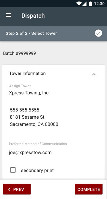
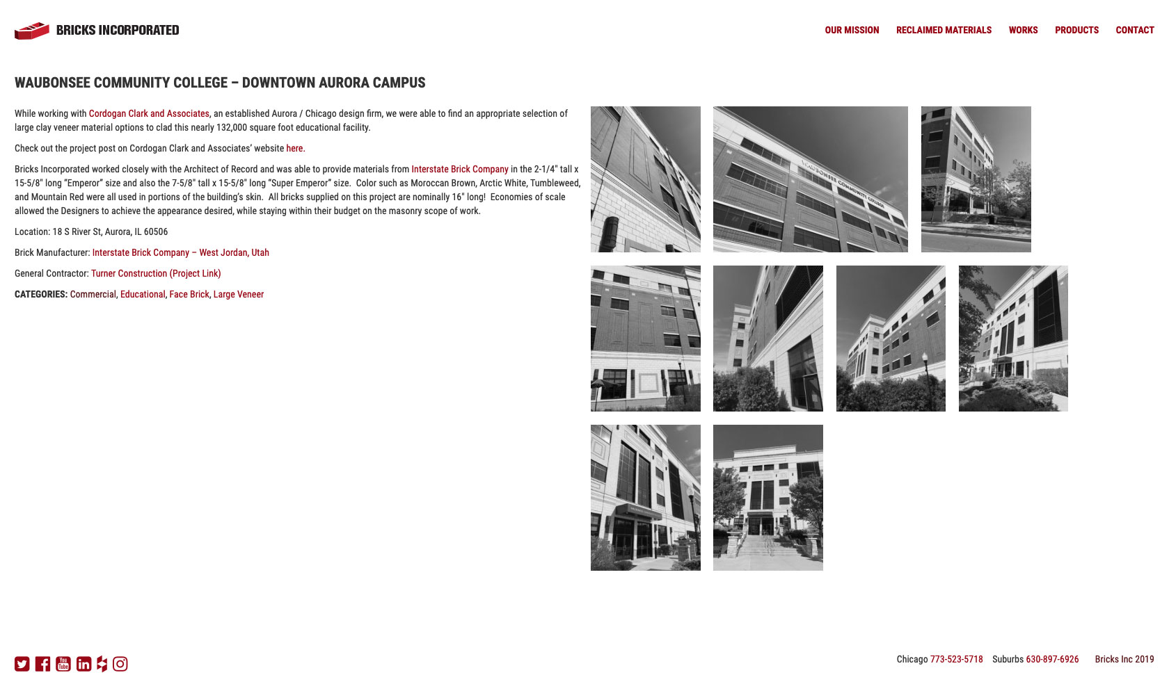
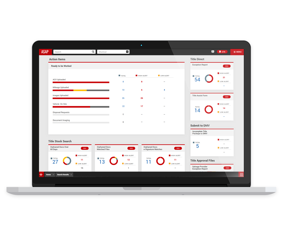
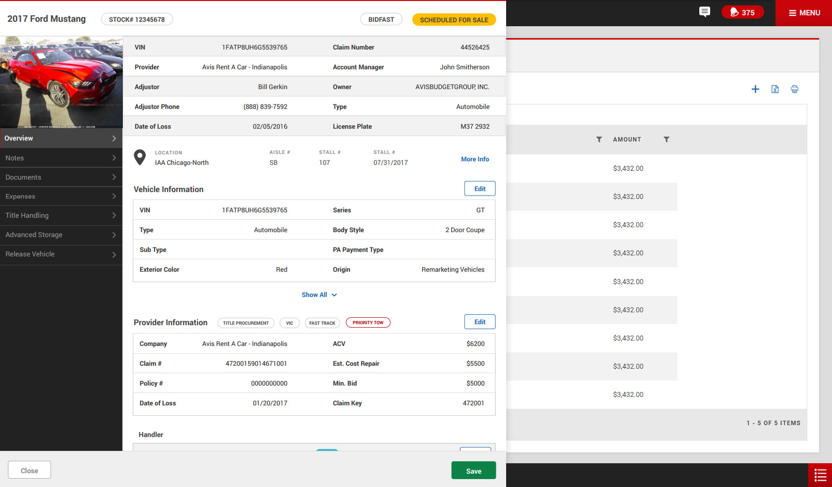
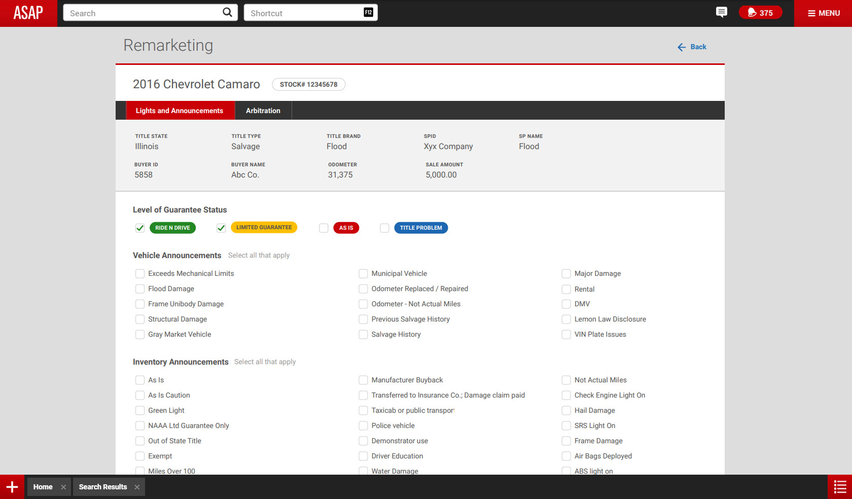
Product Details (2020)
The 'Products' app, often called the Swiss army knife of store apps, was praised for supporting a variety of store tasks, unlike other more specialized apps. This versatility led to challenges in placement and growth, as it was often tasked with integrating new features for cross-functional alignment. Some initiatives, like the 'Selling' feature, were implemented despite not aligning with associate feedback or team goals.
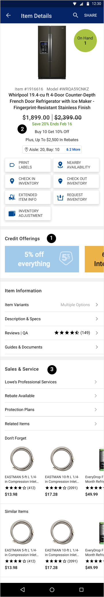
Promotional elements such as credit offerings and sales were scattered throughout the UI, targeting customer interactions but rarely tested by users. This led to a bloated experience, hiding valuable information and causing navigation issues. The UI became gridlocked, making it difficult to prioritize new features.
In early 2021, Lowe's CEO Marvin Ellison highlighted inventory management concerns after experiencing issues firsthand. To address this, a 'shipment' feature showing Upcoming Arrivals was added, but it was hidden due to UI limitations. Despite strong performance reports (Ease of Use: 7, Usefulness Score: 6.88), the app lacked a clear problem statement, leading to uncertainty about its purpose.
Inventory information became a key focus, prompting discussions on how a redesign could impact associates' workflows and whether it was justified by the need for better inventory management.
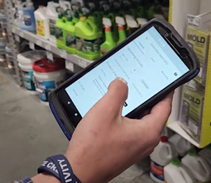
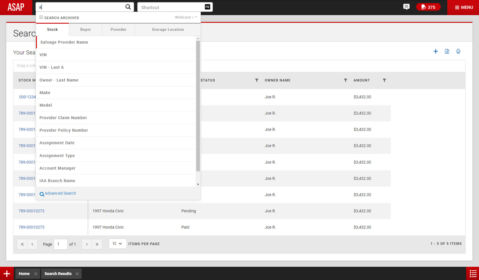
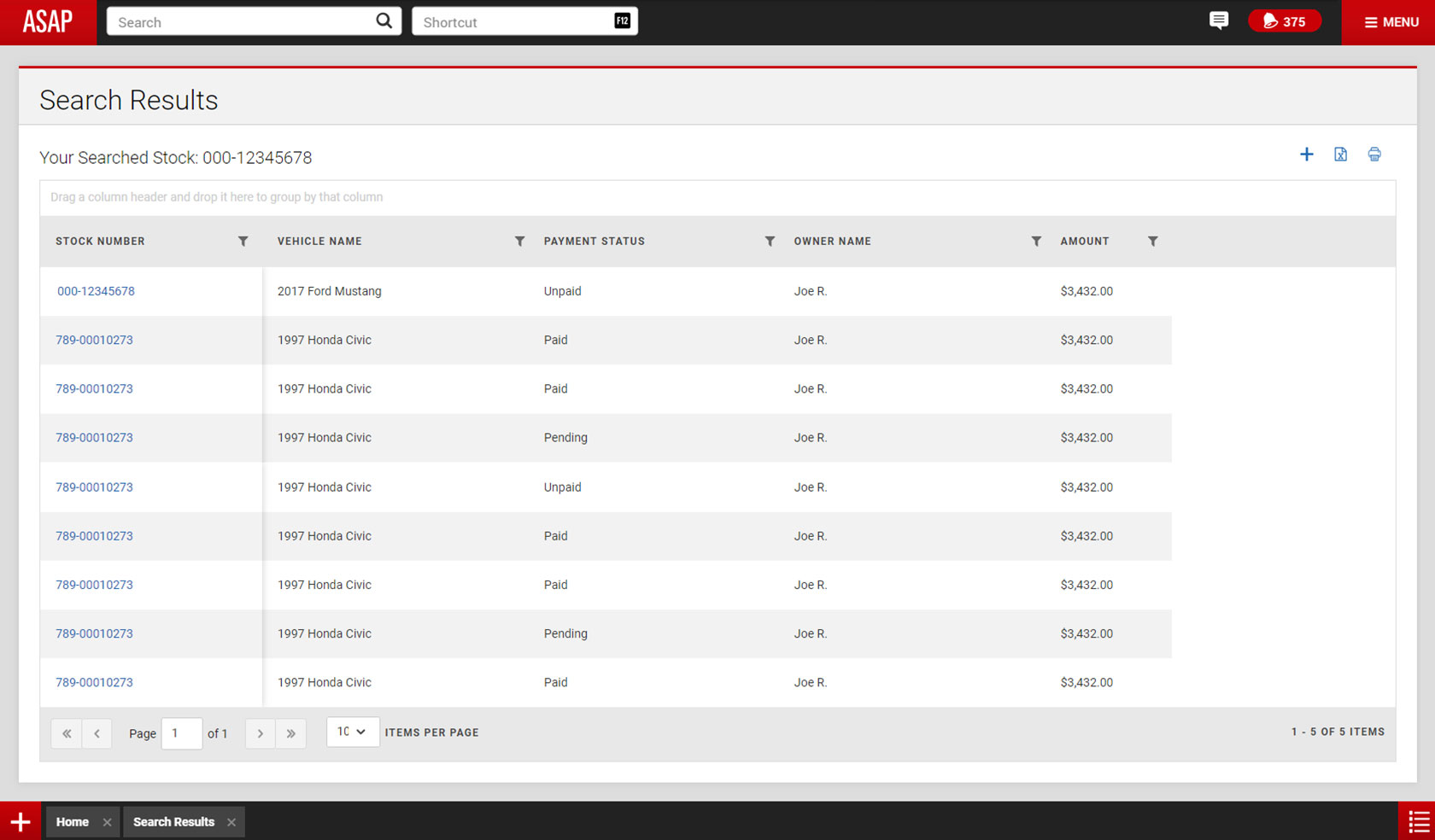
To identify which features of our app were most used, we needed a careful approach to ensure we didn't remove key information and functionality. The primary experience offered by the Products App is designed to be brief, with users being only one scan away from product details. While analytics track user behavior, they don't reveal what users are specifically viewing on the screen, requiring us to adopt a unique approach.
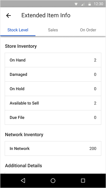
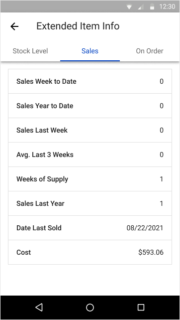
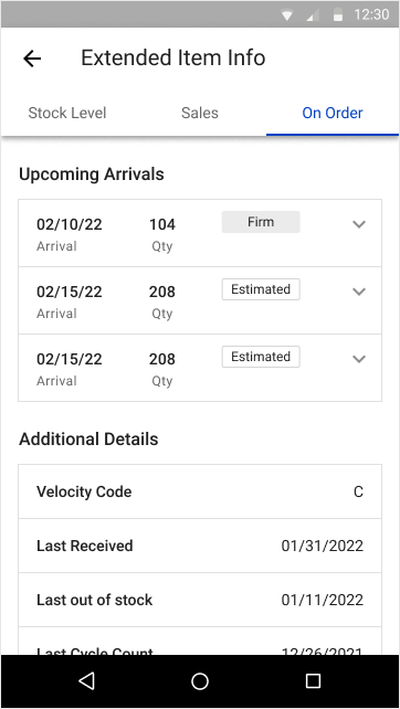
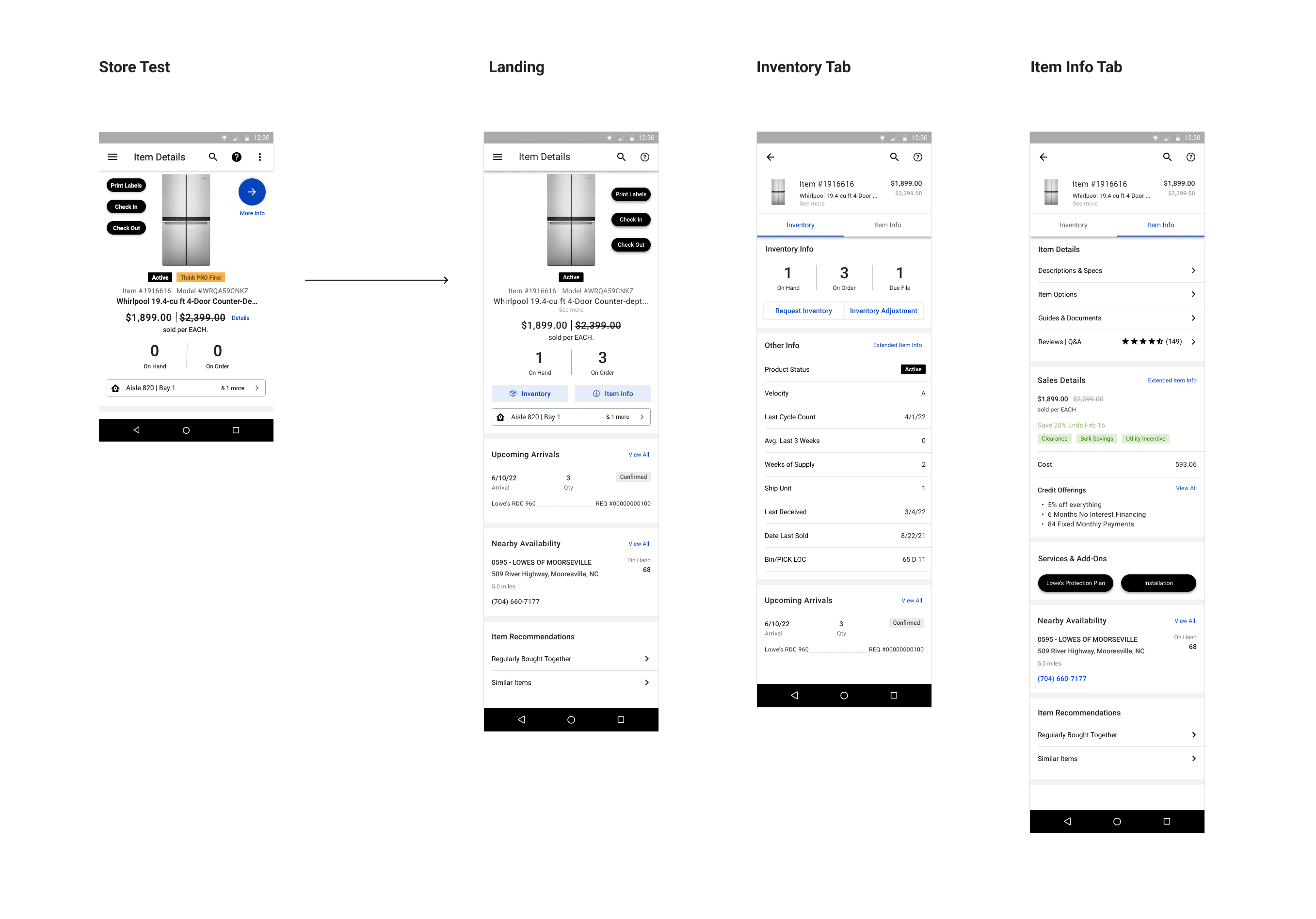
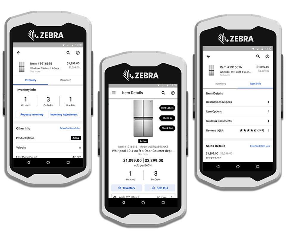
Visits to the Product Detail Page (PDP) and Extended Item Info (EII) were a focus, with EII being viewed 7 million times weekly. EII extends the PDP by providing detailed Inventory, Sales, and Order information. By analyzing user journeys from PDP to EII, we could determine what data was most relevant for store tasks and customer assistance.
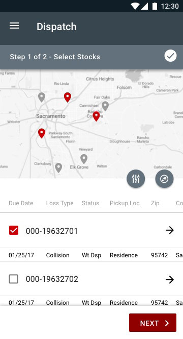
Extended Item Info (EII)
Gathering User Preferences and Making Changes to EII. We anticipated that newer associates might struggle with EII navigation, so we aimed to ensure the experience was intuitive. A card sorting exercise revealed that most associates were comfortable categorizing EII content into Inventory and Sales, with a new category, “More Information,” emerging. This exercise confirmed the importance of inventory information and provided direction for improvement.
In March 2022, we conducted qualitative interviews and a quantitative decision matrix test with 9 store participants to understand how associates interacted with EII. We aimed to assess the value and comprehension of the provided information. The feedback was categorized into store tasks (Inventory) and selling tasks (customer engagement).
Our findings included:
- Inventory information in the stock level tab was the most valued.
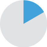
- Sales information scored poorly, likely due to its relevance only to managers and supervisors.
- Upcoming Arrivals (Inventory) scored low among newer associates, indicating discoverability issues.
This data guided our focus on inventory information for the next phase of work.
With validated insights, we presented our findings to stakeholders. UX and business partners collaborated to enhance the Product Detail Page through workshops, design sprints, and user testing.
We identified main themes: finding, knowing, and managing the product, addressing pain points like space usage, feature prioritization, and audience diversity. Use cases included locating products, being knowledgeable for sales, and managing store inventory.
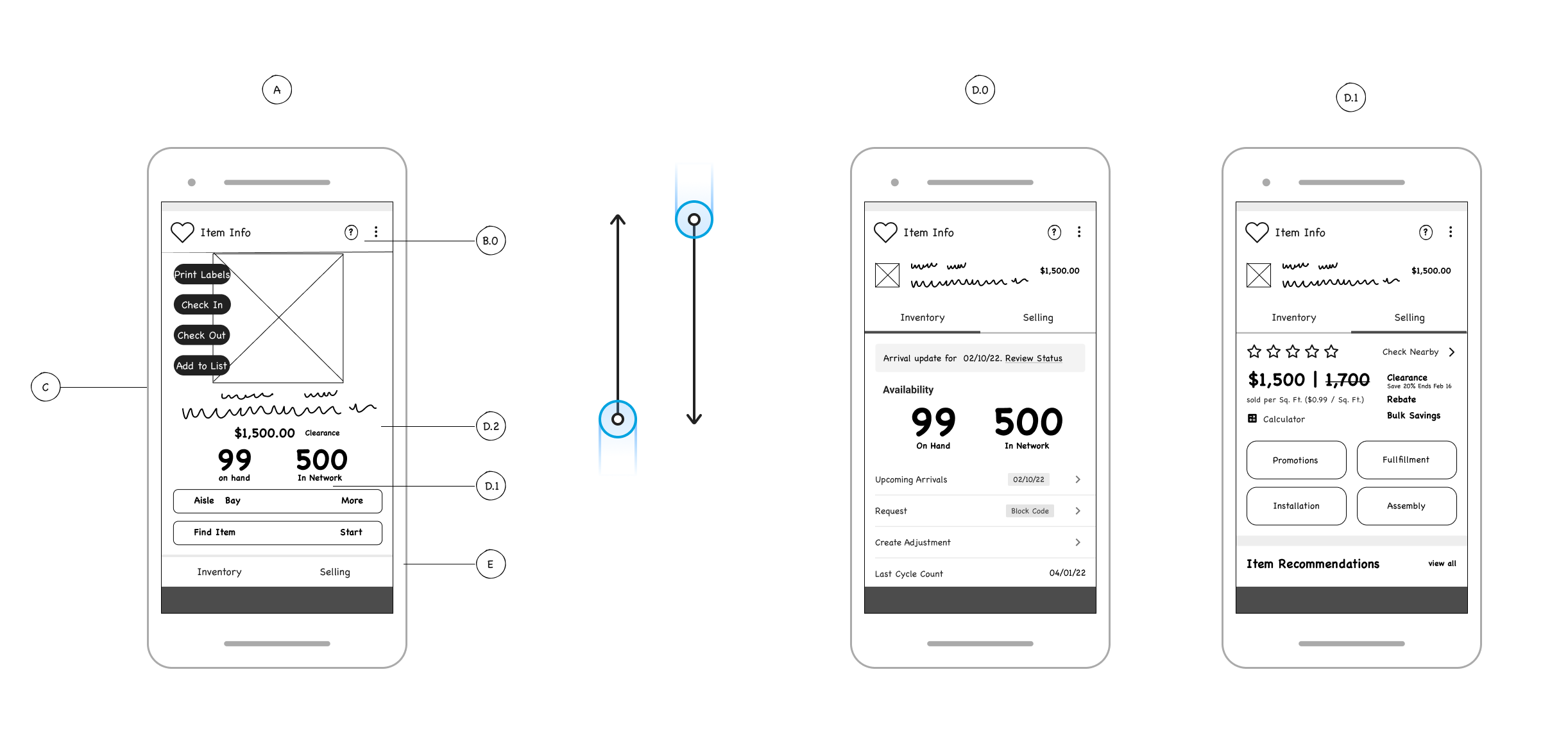
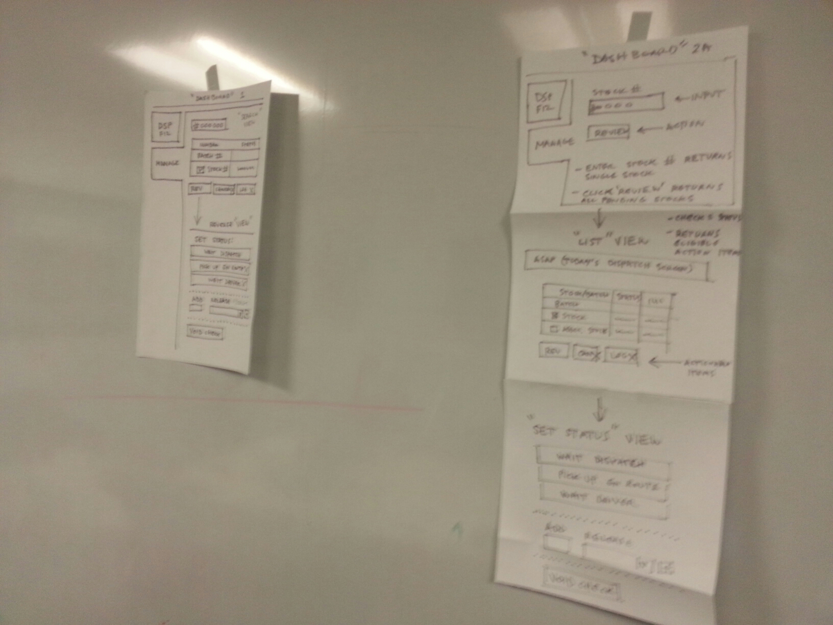
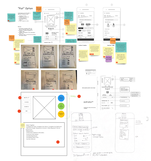
We developed two low-fidelity concepts tested via a prototype on associates' Zebra devices. Both concepts shared a core structure but varied in presentation and behavior:
-
“Nested” Option
This concept featured streamlined, front-and-center content, reducing clutter and using gesture patterns for accessing additional content. It aimed for a modernized interface with essential information only.
-
“Flat” Option
Similar streamlined content but allowed users to scroll for additional information like Upcoming Arrivals, Nearby Store, and Item Recommendations, promoting sales beyond the store.
We tested the prototypes with 38 participants across 9 stores, presenting 5-6 tasks for each option.
"Nested” Concept
- Pros: Tech-savvy users found it intuitive, modern, and easy to use.
- Cons: Less experienced users found it challenging and noted that returning to the PDP landing page was not intuitive. Some information felt hidden.
"Flat” Concept
- Pros: Positive reactions to additional content and intuitive scrolling.
- Cons: Some confusion about the “More Info” button leading to mixed interpretations.
Common feedback included appreciation for new inventory content and enhancements. Associates stressed the importance of quick, easy navigation and raised concerns about unnecessary changes potentially slowing discoverability.
We adjusted the design to address concerns, such as enhancing the “More Info” arrow for better context and navigation. Each component was reviewed to support various inventory scenarios, ensuring accuracy and interconnectivity.
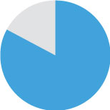
Ultimately, the “Flat” option was preferred by 75% of participants.
The final design achieved our goals, transforming the Products App into a comprehensive store tool. We integrated inventory information without displacing existing data, ensuring users retain access to familiar features while benefiting from new functionalities that enhance productivity.
The app now offers a more targeted experience, aiding associates in understanding product placement and management within the store. After presenting to stakeholders in Q4 2022, we received approval to proceed. However, due to lower earnings, the initiative is on hold, with plans to integrate key elements like Inventory Health, Inventory Request, and Inventory Visibility throughout 2023.
Figma, Miro, Axure, User Testing